In-app engagement ecosystem for Microsoft 365 subscription
Co-led the design and successfully launch of an engagement ecosystem that transformed how 47.5M subscribers interact with their premium benefits, driving feature adoption and strengthening retention.
Role
UX designer
Team
Microsoft 365 growth team
Year
2020-2021
The challenge: Unlocking hidden value for 47.5 million subscribers
Despite Microsoft 365’s massive premium subscriber base, a significant discovery emerged from our research and data: many users weren’t aware of or utilizing their full subscriptions benefits. This awareness gap represented a missed opportunity for both user retention, satisfaction, and business growth.
My contribution: Building from 0 to 1
• Transformed an initial concept into a shipped product.
• Developed an architecture system with mapped out key scenarios across the user lifecycle. Iterated design decisions through two user testing cycles.
• Collaborated across feature teams to maintain product cohesion.
• Partnered with the accessibility team to ensure inclusive design
• Supported the beta rollout to Microsoft Insider subscribers, worked with engineering to refine the experience, and launched an MVP with AB testing to track performance metrics and drive future enhancements.
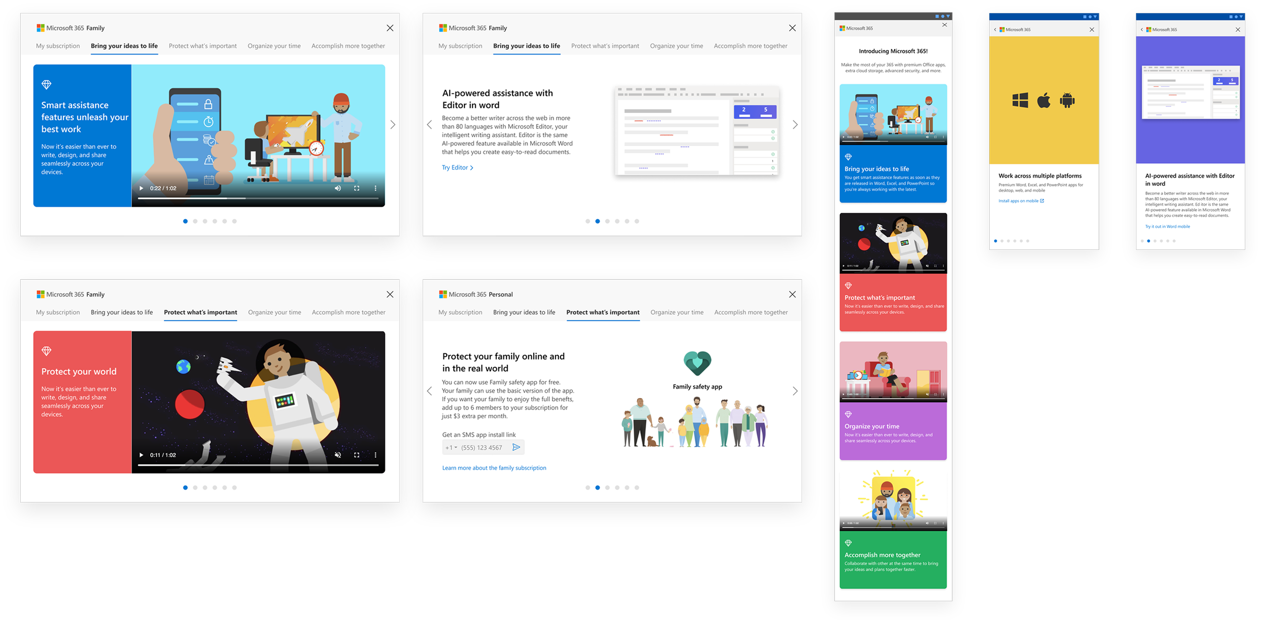
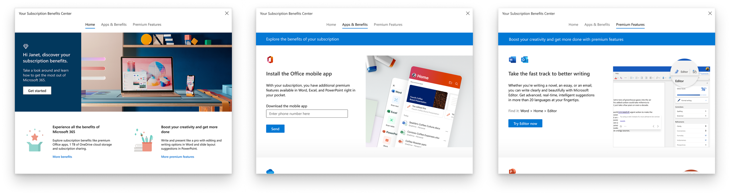
Final solution
Benefits Showcase
Transforms abstract subscription value into actionable advantages with:
Benefit-focused descriptions highlighting outcomes
One-click activation buttons
Seamless mobile app downloads and family plan sharing options
Welcome Hub
A personalized gateway that immediately establishes premium value. Curated benefit cards with visual indicators guide users to high-value features based on their usage patterns, eliminating confusion about upselling while inviting exploration.
Premium Features Gallery
An interactive discovery space that encourages feature exploration across the Microsoft 365 ecosystem:
Features grouped by user goals rather than applications
Contextual examples demonstrating real-world usage
Direct "Try it" pathways that instantly launch premium capabilities
Our design process
This is a high-level catch-up process, not a full representation of all the processes my team and I went through, which included a ton of design iterations, studies, user testings, trials and errors. However, I have a sneak peek at product thinking behind all solutions you already saw.
The foundation
Mapping user stories
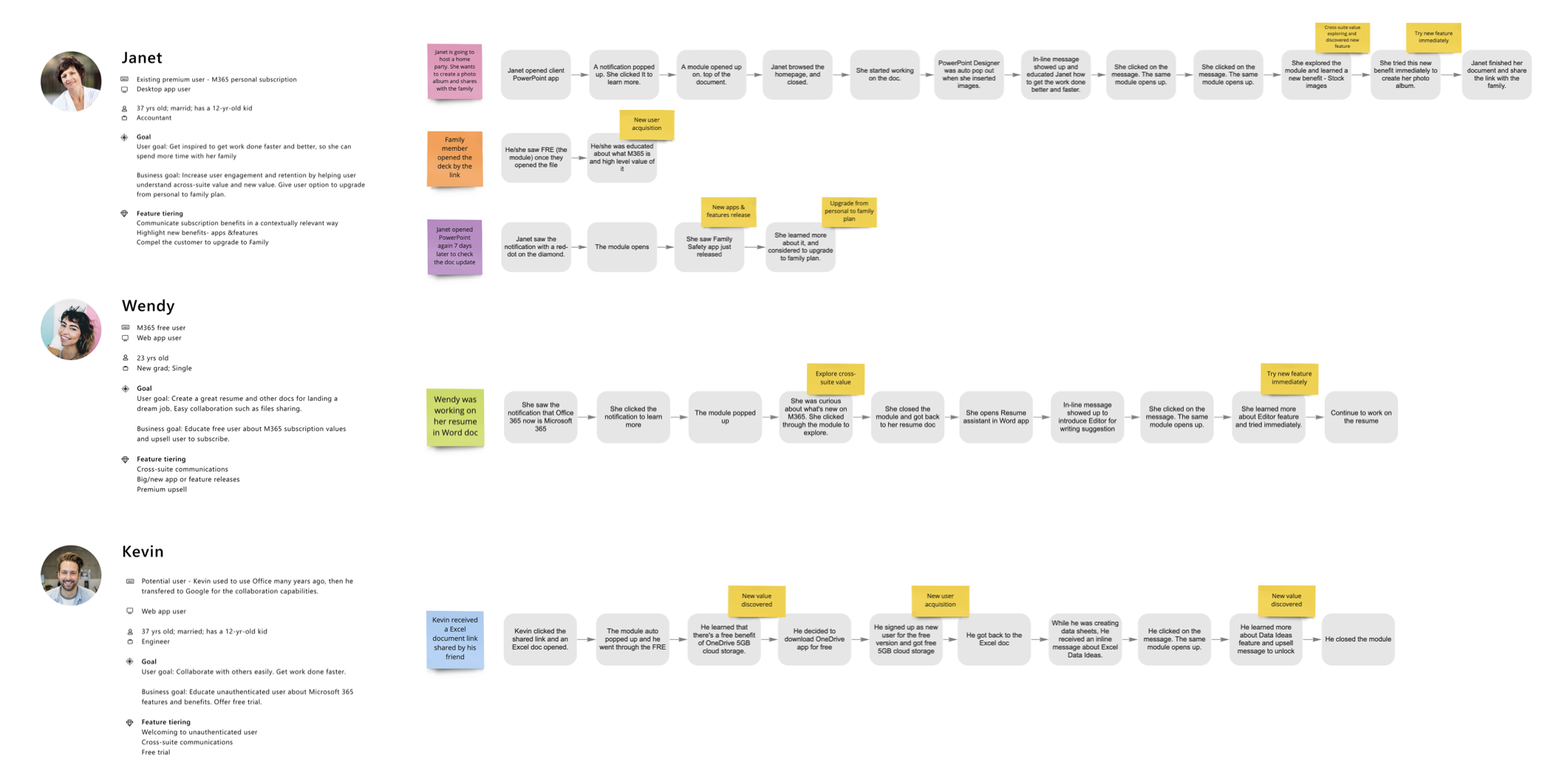
It enabled us to emphasize and understand the pain points, the challenges, and identify design opportunity
I began by diving deep into mapping user journeys, building UX architecture and developing comprehensive use cases to gain a holistic perspective.
This critical foundation helped us balance being informative without becoming intrusive. By aligning user goals with business objectives, we uncovered both opportunities and pain points.
Building UX architecture

To gain a holistic perspective when dive into design, we build an architecture system and mapped out scenarios across the product lifecycle and uncover key triggers and moments from user perspective.
Analyzing Information structure
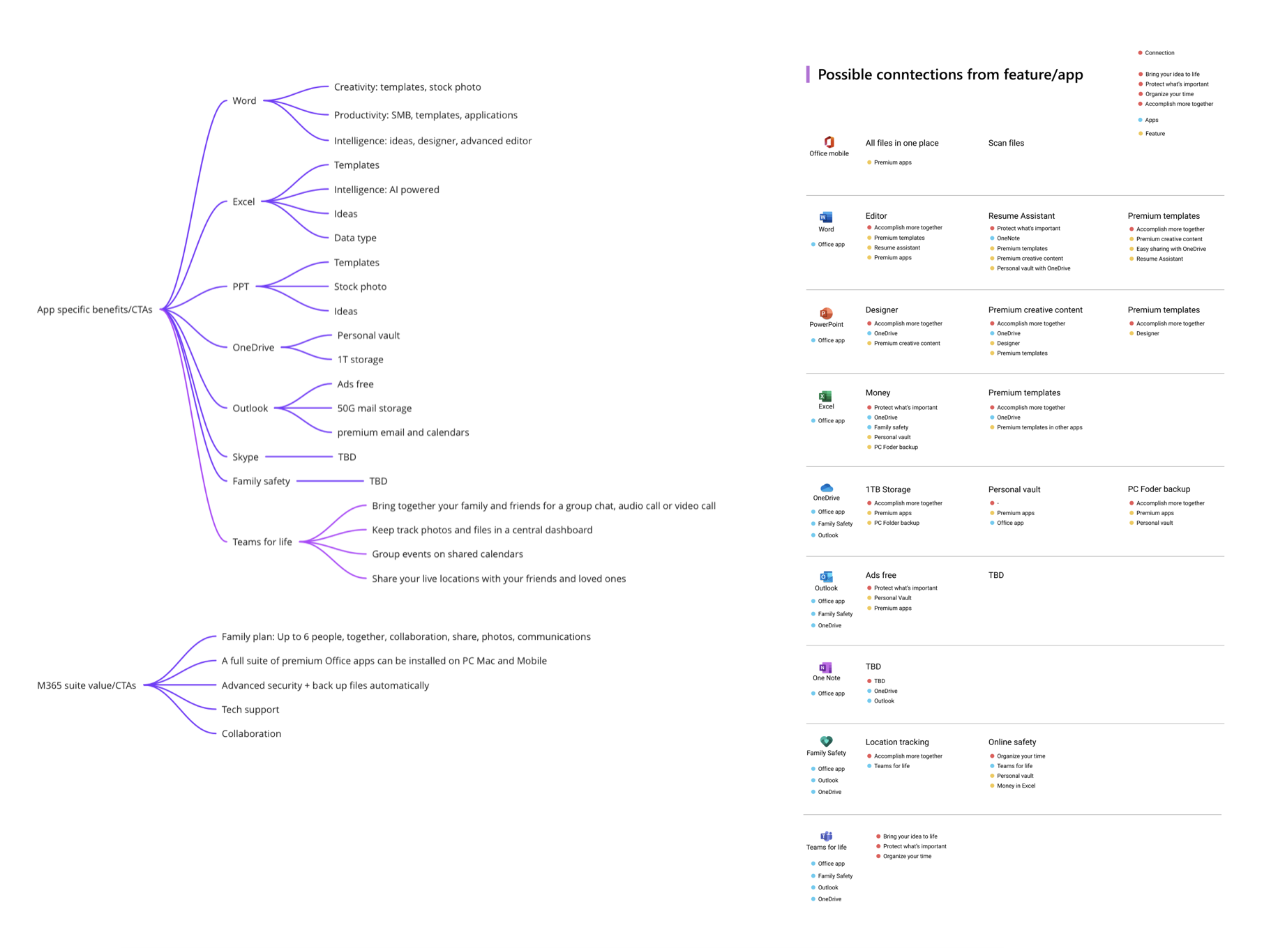
We developed a cross-suite value communication strategy: engage user from a single feature level as a start point, and then drive user to explore a broader value.
Iterative design & user validation
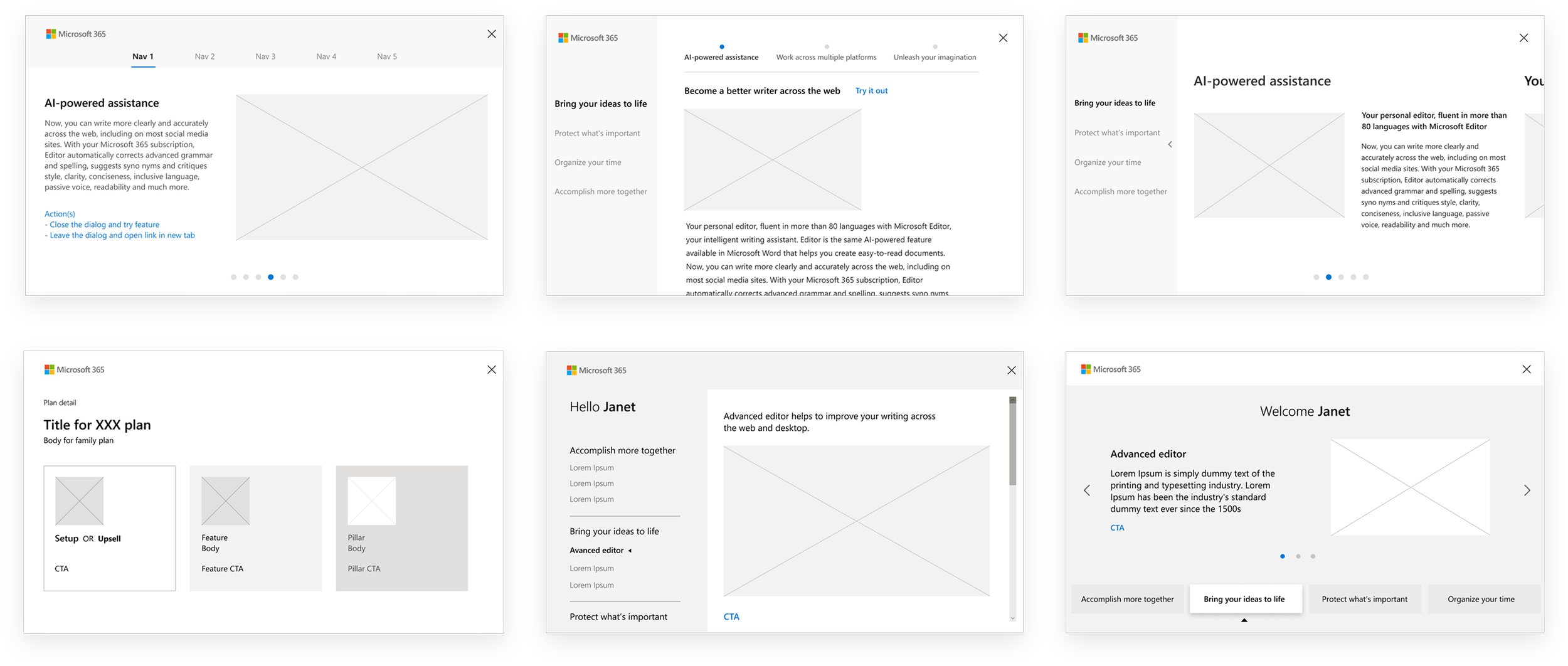
Preliminary explorations
Exploring the basic structure of user interaction and initial mockups that leveraged existing design patterns for cross-company coherence
User research
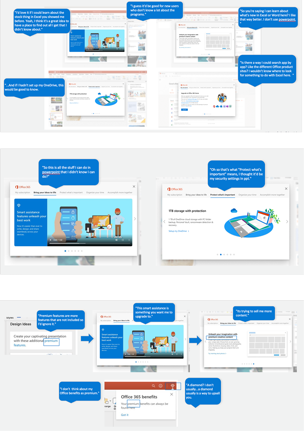
As a designer, I'm nowhere close to a user. Our design assumptions might not even be relevant. We need a deep product understanding with thorough user research to have an opinion.
Collaborating with UX researcher, we conducted 2 rounds of user testings. The main focus was to understand if it's fulfilling an unmet need, something the user would value, and fits into their workflows and mental models. Also, to evaluate the overall interaction experience.
Leverage user research insights to drive UX iterations:
The user research findings continuously improved user experiences and were directly incorporated into the product strategy.
Here is an example:
What we learned
👍 Participants liked the idea of discovering / exploring cross-suite
value within the module
🤔 Participants did not initially realize the module's purpose, and they were confused by its structure or navigation.
🤔 Participants initially thought the notifications and module
were an upsell
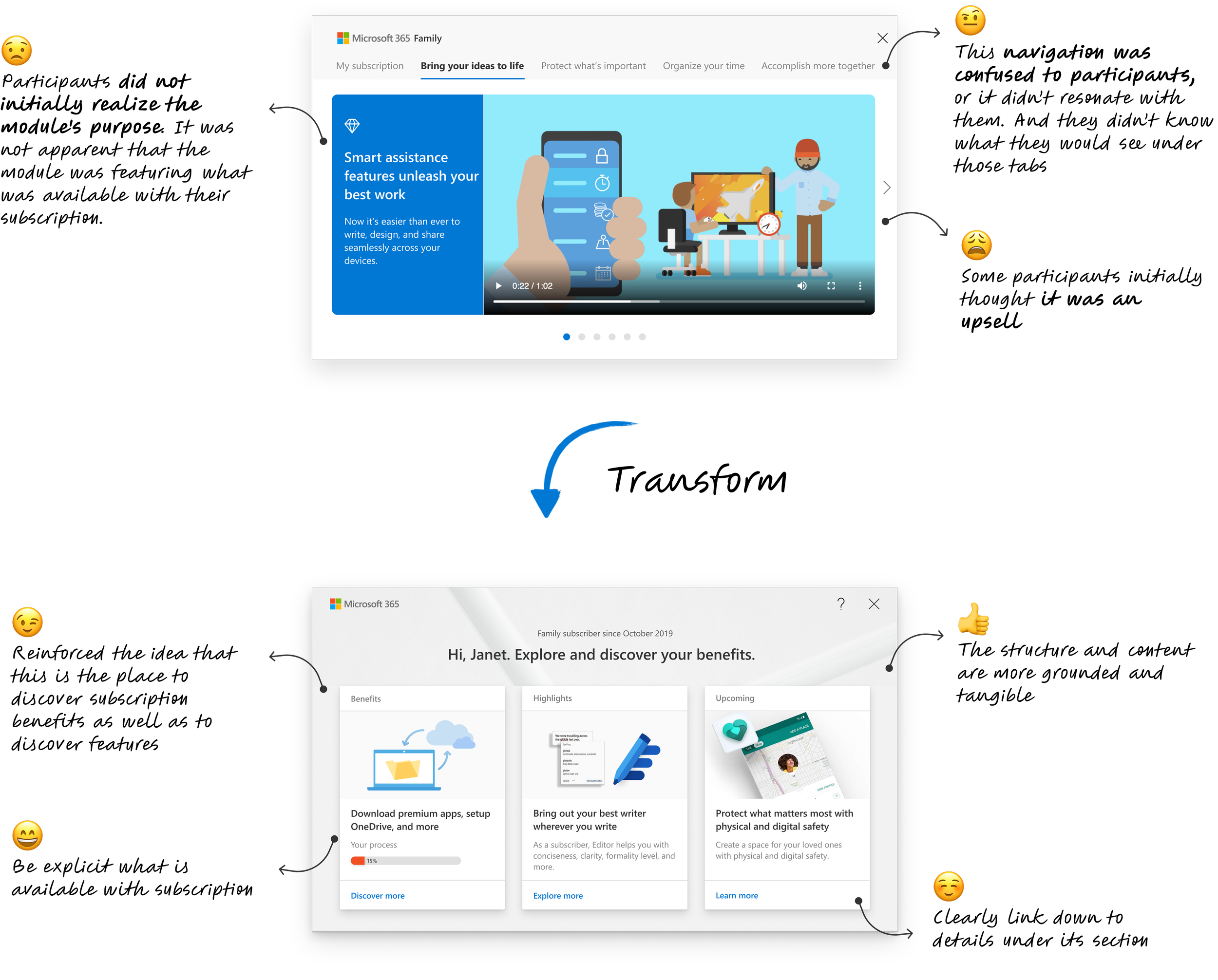
Continued iteration through user research insights
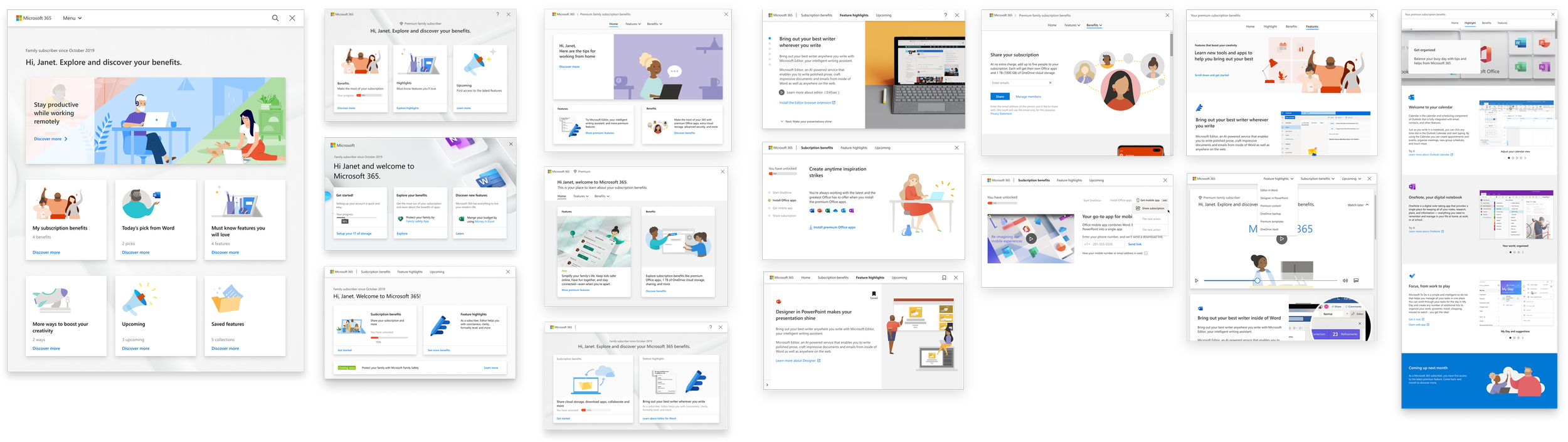
Final design solution for MVP
Keep testing and learning
As a brand new surface, we have designed around a set of base assumptions. While they have been user tested in the lab, we need learnings from the MVP to validate them. Metrics we will measure the success::
• Entry point engagement at targeted click-through rates
• Specific action completion rates
• Homepage click-through rates to deeper content
• Deep content view percentage goals